It would be just like me to tease you with a clever, ironic headline like this introducing a long, detailed analysis of the British mortality data.But in this case, Im being serious.This article is about why I think the data are unreliable and unworthy of our credence.In August, the British Office of National Statistics (ONS) releaseddata on all-cause mortalitybroken down by age and vaccination status.
The ONS data covers months from April, 2021 through May, 2023.This is exactly what we need to determine if the COVID vaccines have saved lives.Data by cause of death are tainted because hospitals have been incentivized to treat deaths with COVID differently from other deaths.But total death counts are harder to corrupt.
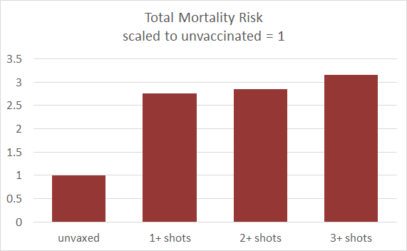
I wish that more countries would release such data.(Are you listening, CDC?)Ive written about dangers of the COVID shots, includingone analysisestimating deaths in the hundreds of thousands for the US alone.I should be eager to vindicate my prediction with new data, and the aggregated British data appear damning.On its face, the straightforward, aggregate calculation says that vaccinated people are three times more likely to die than unvaccinated.The British data is broken down into seven age categories.
(Children are not included.The lowest age category is 18-39, and thereafter the age categories are by decade.) Lets zoom in on the youngest age group:A small number of subjects had bad reactions to the first shot, and discontinued from there.These people have elevated risk from the vaccine, but among those who went on to get the full sequence + boosters, the shots appear to be protective.Other age groups show the same pattern.
For example,For every age group, multiple COVID shots appear to be protective against death from any cause.A statistics lessonOf course, its mathematically impossible that within every age group, the vaccinated are atlowerrisk of death but when you aggregate all the age groups together, it turns out that vaccinated people are at ahigherrisk of death.Thats what I thought.I spent a whole evening checking and rechecking the calculation.But I might have rememberedSimpsons Paradox.The data are correct.The graphs are correct.
The key to understanding the situation is that the lions share of the deaths (the numerator) are in the oldest age groups, but most of the head count (the denominator) is in the younger age groups.Crucially, the vaccination rate among the young is much lower than among the old.So what we are seeing in the aggregate chart is that the oldest people are more likely to be vaccinated, and they are also more likely to die.But that doesnt mean that vaccination is causing the deaths.So, does this vindicate the vaccines?I have writtenandothers have writtenthat side effects from the COVID vaccines, including risk of death, are so much higher than vaccines of the past that its hard to see them on the same scale.Furthermore, there isinsurance datashowing that death rates are up as much as 40% in working people, andanecdotestell of people havingsudden heart attacksand (widely debunked)turbo cancers.How can this be reconciled with the idea that, in each age group, multiple COVID vaccinations are associated with lower rates of death from all causes?In the 18-39 age group, almost no one is dying from COVID.The most significant causes of death are accidents, suicide, and overdoses.
It is not reasonable to think that three COVID shots have the effect of lowering these risks by 20%.The most plausible explanation is a strong healthy user effect.People who are unvaccinated are, on average,poorer and less educatedthan the rest of the population, and it iswell-accepted that death rates are closely correlated with social class, especially at the lower end.More speculative is that the data has been tampered with, deliberately doctored to hide the vaccines dangers.
See below, Fraudulent manipulationFor these reasons, I think there is not much to be learned from the new British data.A pattern too stark to ignoreThere is one result embedded in the data that is highly significant (p<0.00002) and implies a role in the vaccines for excess mortality in 2021.During the months March December, the all-cause death rate in the UK rose by 30%, and the rise was tightly correlated with the cumulative number of vaccinations (R=0.96).This rise did not continue into 2022, but the overall death rate remained elevated.This pattern, again, cannot be explained as simply as a huge death toll from the vaccine.
Thirty percent is enormous, and cannot be hidden by any governments manipulation of the statistics.I knowEd Dowdhas famously documented a 40% rise in insurance claims against corporate group life policies; but it was only possible to hide that 40% bump because the base rate among these young people employed by large corporations was so low that 40% of that was too small to show up in a graph of whole-population mortality, which is always dominated by the oldest segments.Since the British mortality increase is in the population as a whole, it must be concentrated in the older population.Part of the 30% rise was seasonal.Death rates increase25% winter over summer.
But part of the increase is likely due to a lingering effect of the vaccines on mortality and morbidity in the oldest group.Evidence for this is in the continuation of the graph into 2022 and 2023.Death rates are more variable, but we see that they reach new highs in the winter of 2023 and never return to baseline.Fraudulent manipulation of the ONS data?Last winter, Madhava Settypublicized research byNorman Fentonsuggesting that ONS had tampered with their COVID data.
The strongest evidence was for the early months, Jan-Mar of 2021, which are unaccountably absent from the latest edition of the ONS data.The current edition begins with April, 2021.The following graphs are derived from the ONSdata release in July, 2022.The charge that is easiest to verify is that deaths from the vaccine rollout have been shifted into the unvaccinated column.
We can see this in the form of a spike in deaths of theunvaccinatedjust as the vaccines were being rolled out.This is most prominent in the death rate for the oldest groups.This spike is hard to miss three times as many deaths as expected in the small unvaccinated group in those first months when the much larger vaccinated group of elders was being given early priority for the vaccine.Nursing homes were first to be vaccinated.In the spring, the vaccine was distributed to middle-aged citizens, and remarkably we see a similar bump in deaths of unvaccinated people in that age group.
The bump started later and is more spread out, corresponding to the fact that middle-aged people signed up for the vaccine more gradually.Starting in the summer, the vaccine was recommended for younger people, and we see a bump for mortality in unvaccinated adults under 40 begin in June.The Jan-Mar data for 2021 has been censored in the new ONS release, and with it the evidence for the obvious spike in the older age groups.But what of the humps for younger age groups? Are they visible in the new data?To answer this, Ive plotted data from 2022 and 2023 on the same graph for each age range, so we can see where they match and where they dont.At older ages, the data match nicely.But for younger ages, the data have been revised upward, making the humps more prominent.
I interpret this to mean that more post-vaccine deaths have been moved into the unvaccinated group.For the youngest ages, it looks as though the data were adjusted more, proportionally, but the scale is much smaller because the death counts are very low for the young.The bottom lineIll end where I began this entry.Im not going to analyze the British ONS data because I dont think the numbers are reliable.
Disclaimer: This story is auto-aggregated by a computer program and has not been created or edited by Senior Savings Deals.
Publisher: Josh Mitteldorf ( Read More )
Publisher: Josh Mitteldorf ( Read More )